Last updated at Mon, 06 Nov 2017 18:35:03 GMT
Introduction

Controlling the layout of web pages and applications has always been a little tricky. In the beginning, there were almost no mechanisms for page layout, other than some basic formatting of html tags. We could apply some font styling, add background colors, and with the use of paragraph’s and line breaks could achieve some block spacing.
With the introduction and evolution of CSS, it gave us further control, but more importantly, control over the elements box model. We could now float elements to the right or to the left of each other, display them inline-block. Position them absolute or fixed to the box model or within its relatively positioned parent container.
We’ve been using and applying these methods for so long now that most of us have become masters at building complex layouts, but if you think about it, these are not very sophisticated layout tools and require some hackery and tricks to get the desired result. Furthermore, the W3C had originally intended floats to solve a common problem of aligning text around images. It was never intended for creating complex layouts as is currently used today, but with no other alternative other than table layouts, floated div’s quickly became the order of the day and still is to a large extent.
There are many CSS grid frameworks available today that provide you with every imaginable layout, using all manner of black magic trickery so you don’t have to bog yourself down with workarounds or hacks. You simply reference your library, add the appropriate class to your div and hey presto! the desired layout appears before your eyes.
Using anyone of these many grid frameworks is all well and good and gets you up and running without writing a single line of code. However, if you are like me (old skool), and you prefer to roll your own and want to be in full control of what gets delivered to the browser, you may want to consider using CSS3 layout.
Enter Flexbox: aka the Flexible Box Layout Module.
What is Flexbox?
Flexbox is one of many CSS3 layouts that plays an important role in the evolution of how we build applications now and into the future.
Flexible by name, flexible by nature, flexbox allows you to shrink, stretch, grow, align and space elements relative to their parents. The best part about it is, it’s very easy to use.
A Brief History
There are three versions of flexbox, which are differentiated by the syntax changes between 2009 and 2012:
- The new syntax is in sync with the current specification (e.g. display: flex).
- The tweener syntax is an unofficial syntax from 2012, adopted only by IE 10 (e.g. display: -ms-flexbox).
- The old syntax is from 2009 (e.g. display: box).
Browser Support
Here is how the land lies with Browser Support as of writing this article.
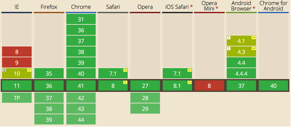
Courtesy of Can i use:http://caniuse.com/#search=flexbox
Flexbox Properties
Let’s take a look at the properties of flexbox
display: flex | inline-flex
align-content: flex-start | flex-end | center | space-between | space-around | stretch
align-items: flex-start | flex-end | center | baseline | stretch
align-self: auto | flex-start | flex-end | center | baseline | stretch
flex: none | [ <'flex-grow'> <'flex-shrink'>? || <'flex-basis'> ]
flex-basis: content | <'width'>
flex-direction: row | row-reverse | column | column-reverse
flex-flow: <'flex-direction'> || <'flex-wrap'>
flex-grow: <number>
flex-shrink: <number>
flex-wrap: nowrap | wrap | wrap-reverse
justify-content: flex-start | flex-end | center | space-between | space-around
order: <integer>
Applying these properties
Flexbox consists of Flex Containers and Flex Items. A Flex Container is declared by setting the display property of an element to either flex or inline-flex. With flex the container is rendered as a block. With inline-flex the container is rendered inline.
Note: in order to see flex working in the majority of browsers, you will need to add the appropriate prefixes, for example:
display: -webkit-box; /* OLD - iOS 6-, Safari 3.1-6, BB7 */ display: -ms-flexbox; /* TWEENER - IE 10 */ display: -webkit-flex; /* NEW - Safari 6.1+. iOS 7.1+, BB10 */ display: flex; /* NEW, Spec - Firefox, Chrome, Opera */
For the purpose of this article though, I will not include the prefix. If you want to know more about which CSS3 properties needs prefixes, check this page out: shouldiprefix
Examples
For all examples, I will be using the same HTML and just playing with CSS to demonstrate Flexbox properties.
Flex Property – display: flex
HTML
<div class="flex-container"> <div class="flex-item"></div> <div class="flex-item"></div> </div>
I’ll also start with some basic CSS styling to apply background colors, margin, padding etc., so it is easier to see the three flex-item div’s displayed in the browser.
CSS
.flex-container { display: flex; background: DarkSlateGray; height: 400px; } .flex-item { background: DarkTurquoise; margin: 5px; padding: 1em; width: 80px; height: 80px; }
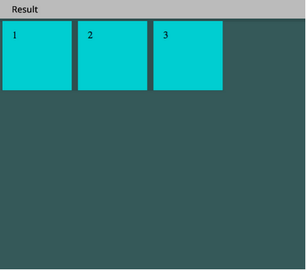
In the example above I am declaring a Flex Container with
display: flex;
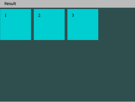
Flex Property – flex-direction
By default this places all of the flex-container’s children in a row. Adding flex-direction: row; achieves the same result, but in this case is not necessary.
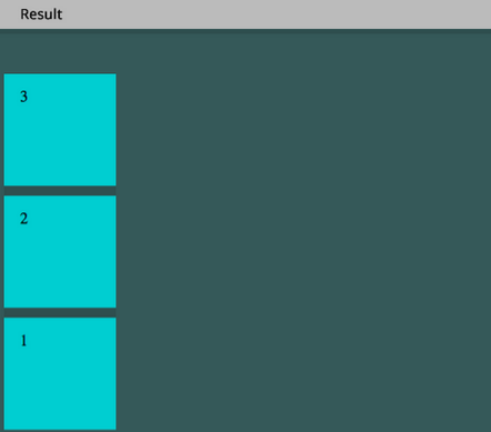
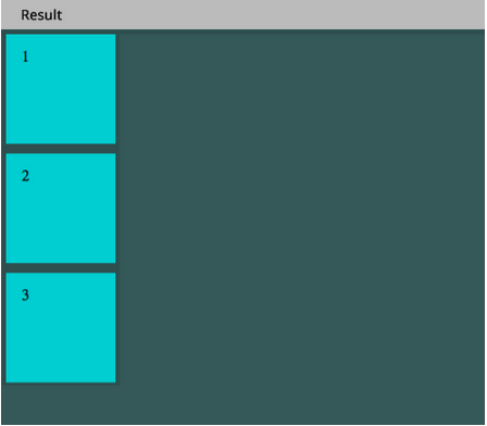
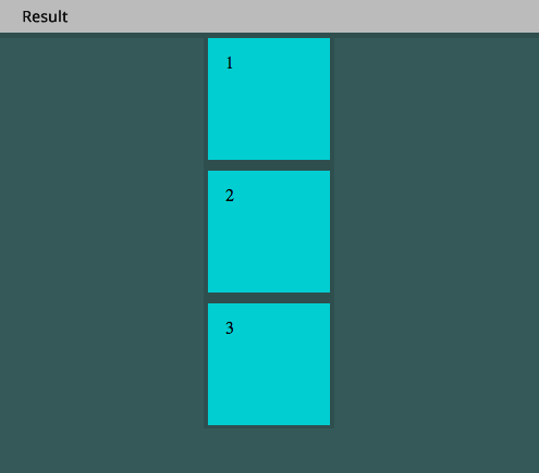
OK, so now let’s change the direction and stack these elements on top of one another by adding flex-direction: column;
CSS
.flex-container { display: flex; flex-direction: column; }
Here is the result:

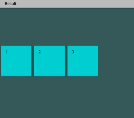
We can also reverse the direction of the column and row.
CSS
.flex-container { display: flex; flex-direction: column-reverse; }
This will result in the following:
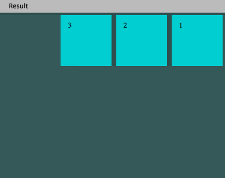
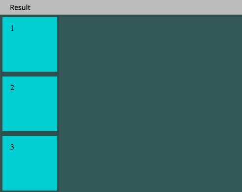
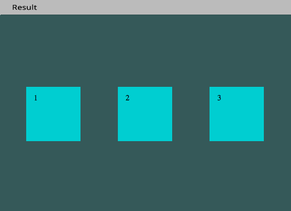
CSS
.flex-container { display: flex; flex-direction: row-reverse; }
row-reverse;
will do this:
Flex Property – align-items
We can re-position flex items using flex-start | center | flex-end
Row with align-items: flex-start;
CSS
.flex-container { display: flex; flex-direction: row; align-items: flex-start; }
Row with align-items: center;
CSS
.flex-container { display: flex; flex-direction: row; align-items: center; }
Row with align-items: flex-end;
CSS
.flex-container { display: flex; flex-direction: row; align-items: flex-end; }

Likewise, flex-direction: column; with align-items: flex-start
CSS
.flex-container { display: flex; flex-direction: column; align-items: flex-start; }
Column with align-items: center
CSS
.flex-container { display: flex; flex-direction: column; align-items: center; }

Column with align-items: flex-end;
CSS
.flex-container { display: flex; flex-direction: column; align-items: flex-end; }
Flex Property – justify-content
With the addition of justify-content property we can start controlling the positioning of our flex-items.
CSS
.flex-container { display: flex;flex-direction: column; align-items: center; justify-content: center; }
Changing the align-items property now with justify-content: center; will keep them vertically centered within the page while letting you position them horizontally left center or right.
CSS
.flex-container { display: flex;flex-direction: column; align-items: flex-start; justify-content: center; }
If we now want that to appear justified center but on the right, just change to align-items:flex-end;
CSS
.flex-container { display: flex; flex-direction: column; align-items: flex-end; justify-content: center; }
Flex Tip
Here’s a really neat trick we can do with simply using display: flex; on our .flex-container and setting margin: auto; on the .flex-item. This will center vertically and horizontally, depending on flex-direction and also distribute space accordingly to fit the viewport.
CSS
.flex-container { display: flex; } .flex-item { margin: auto; }
That’s pretty darn cool! Think what you would have to do using float’s, percentage width’s & clearfixes etc.
Flex Grid Overview
Now let’s take a look at the flex property. In the CSS below, i am targeting our 3 .flex-item div’s. The first and third have flex: 1; This is 10% of 100% and our second .flex-item is set to 8, which is 80%.
CSS
.flex-item:nth-child(1) { flex: 1; } .flex-item:nth-child(2) { flex: 8; } .flex-item:nth-child(3) { flex: 1; }
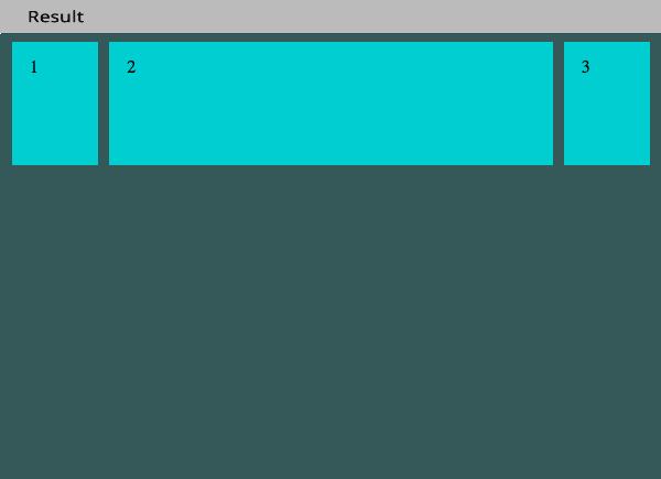
This gives us a 100% fluid layout with (10%, 80%, 10%) spread. We didn’t have to use float’s, width’s or compensate for spacing left and right. It just works.. like magic!
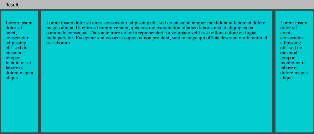
Flex Property – flex-wrap
Finally, I’d like to leave you with one last example which is an age old problem in CSS layout using floats. Getting div’s to match equal heights when you pour content into them. We’ve found ways around this issue, either using JavaScript or CSS hacks & tricks, but it really shouldn’t have to be so much hassle.
This is how it’s done with flexbox
CSS
.flex-container { display: flex; flex-wrap: wrap; } .flex-item { margin: auto; display: flex; }
And the Result..
Conclusion
I think you will agree from how little code was used above, how easy it can be, to quickly achieve flexible layouts, that align the way you want, shrink or fit for any size device. Throw in some media queries into the mix and away you go! Happy Flexing 🙂
Further Resources
• CSS Tricks: A Complete Guide to Flexbox
• Autoprefixer: A Postprocessor for Dealing with Vendor Prefixes in the Best Possible Way
• Using Flexbox to Lay out Applications